

What exactly is meant by cool or warm color? Here is a quick explanation - A color is warm if it looks more red, or yellow, or orange compared to another color, and a color is cool if it looks more blue or green compared to another color. I have put “compared to another color“ in bold Italics to stress the fact that a color is not warm or cool by itself. Instead, it is warm or cool compared to another color.
Let’s look at an example. Look at the chart below:
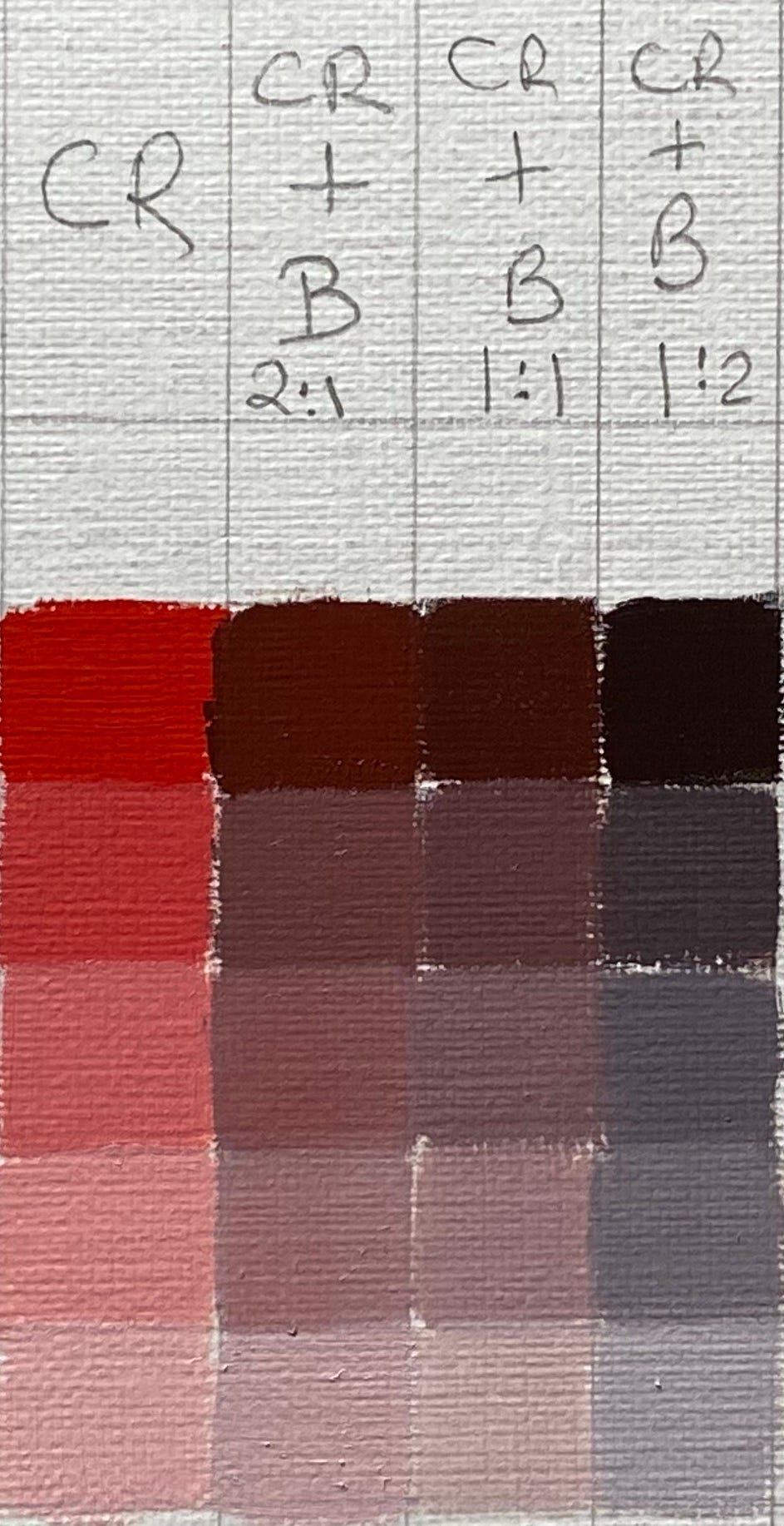
CR stands for Cadmium Red, and B is for Ivory Black. I have mixed them in different proportions (2:1, 1:1, 1:2). If you compare columns 2 and 3, you will see that column 2 looks more warm compared to 3 but cooler compared to column 1. That is color relativity, where one color appears either warm or cool when they are with other colors.
So why is this information relevant, and where will you use it in painting? Well, everywhere! For e.g., If my shadows are warmer and I am using this limited palette of Cadmium Red and Ivory black, I will choose the mix in column 2, and if my shadows are cooler, I will use the one in column 3.
So next time someone says this is a cool color, you should ask them cooler to what? I hope that helps! :)